Thursday 9 October 2014


Assignment 1:Favorite Photographer

       Jerry Uelsmann "The photographer                                     of 20th Century"


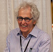
The photographer of his time, Jerry N. Uelsmann, was born on June 11, 1934 in Detroit, Michigan. He was the forerunner of photo montage in the 20th century in America. At the age of 14, his interest sparked in photography and then became his passion. He received his B.F.A degree at the Rochester Institute of Technology, in 1957 and his M.S and  M.F.A at Indiana University in 1960. Afterwards, he began teaching photography at the, University of Florida in Gainesville, in 1960. Jerry Uelsmann, is best known for his beautiful composite images in black and white. In his one photograph there is a combination of several negatives to create a very surreal landscape that intervene various elements like trees, rocks, water and human figures, in just one photograph. It is very hard for us to imagine how he made this beautiful art of photography, since we have so much technology now that we are able to do a similar thing in a matter of minutes. Each photograph consists of contrast, intervening human parts in nature, shadows, and repetition of same image in one photograph and put it together with his magical talent.


"Voyage 2008" photograph taken by Jerry Uelsman.
It represents very wide range of contrast and a deep meaning.
 This photograph shows a characteristic that is very commonly used by Jerry through out most of his photographs. It is contrast between very dark and light. The places he wants the audience to notice, he makes it white or light gray and other places very dark and your eyes don't go towards it. In this picture, he wants the audience to concentrate on the boat in the sky, which attracts attention versus just a boat on the sea. This is the real focal point of this image revealing the main theme of this photograph. This image has a very deep meaning, which is  hope and perseverance. It seems like the boat is the object in the sky which is giving of all the light and is in the place of the sun. The purpose of showing the dark sea surrounding the ocean and one lost person in it, is to show how hopeless and isolated this person feels. Also, when looking at the image it is quite apparent that the person is really further into the ocean meaning that there seems to be no way back. The boat being the focal point is what drives this person to persevere and keep on striving. The use of excellent amount contrast is what leads the audience to understand the meaning of this photograph.


Another talent he puts in his photography is the art of adding human parts or trying to relate to our everyday lives with nature. In this photograph, he has the hands bigger than the rest of the things. In this image he puts the focal point of the image as the hands. It seems like the water in the hands contains something very precious. The purpose of showing the hand in this case is to show the importance of water and everything in it. Again, another common element is also incorporated in this image which is that the hands are light in colour and most of the other things are dark grey or black. This makes it quite apparent what he wants the audience to look at. This image has a very good amount of contrast. By the amount of contrast apparent it seems like the hands are holding most of the water. Giving the message by connecting human parts and nature it makes messages a lot more clear.


This photograph is showing another characteristic that is very unique to Jerry Uelsmann. He uses shadows in an image to add a real effect in the image and this makes the audience look at the photograph for longer and think why he added the effects. The shadow he added on the water makes it look like the small island is floating with the tree on it. The way he added the shadows and the amount of contrast makes it look like everything is floating including the trees which you can see their roots hanging from their bottom. The placement of where he put these shadows is what makes it seem like that the island is floating. Another thing that is noticeable is that he makes both trees float in the same direction. The thing you take the least notice of is the mountains behind the big tree because they are so light in color. The amount of detail and thought he puts in each photograph is just astounding and just the element of shadows creates the image better.


"Edge of Silence"
 This is a photograph that really shows how well he puts the images together. Another common element he has in his photographs is that he uses one image more than one time. The ripple he added to the water is the same ripple he added to the sky. Alot of his images seem like there is a line of symmetry in the middle of the photograph. The purpose of this in the photograph towards the left is to show that the person standing on the cliff is trapped. This image makes it seem like he is trapped from the inside rather than the outside, considering the faint image of a face in the water. The amount of contrast that is usually quiet apparent in most of his photographs is also apparent in this one. It seem like half of the sky is dark and the other half is the light and the person is standing in the middle of it all. There are images in this photograph that you see after a while of staring at this photograph. This element of repeating the same image more than once in the same photograph is not meant to be in each of his
photographs but is quiet apparent in photographs that he wants to show sadness, inner conflict, or some type of isolation. The message that Jerry was trying to convey from his photograph is clear by looking at the amount of detail and the use of this element.


In conclusion, Jerry Uelsmann is a photographer who has great meaning to each and every photo that he puts together. The elements of contrast, shadows, using human parts with nature, and using the same image more than once in one photograph is quiet apparent in a lot of his photographs. The most amazing thing to consider is that all these photographs were made without the use of any computers and technology that we have today. He put them together in the dark room and he feels that this is a better way of doing it, although today's technology has really advanced. Jerry was the main reason and biggest influence on the creation of Photoshop. When he was asked about how he felt about the idea, he said that it is great but he is not willing to leave his dark room practices and start new in the digital world. His work of art is truly unique to him and the images made by technology now are no match to his eye-opening photographs.
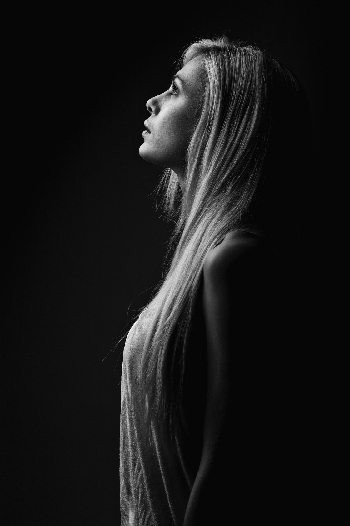
                            My Photograph


This is the photograph I took and put together using the elements that Jerry Uelsmann uses in his photographs. The first element that I used that is very common in all of his photographs is Contrast. The light in my image attracts attention from the audience just like his photographs. There is black and white and the image is sharp. Another element that I used is reflection and repeating the same image and making it look like there is an line of symmetry in the middle. This image uses at least two of the elements that he has in his photographs.  I made it black and white to show the elements he uses more clearly.


Websites I used:

http://www.uelsmann.net/  
http://www.agallery.com/pages/photographers/uelsmann.html 
http://www.digitalphotopro.com/profiles/jerry-uelsmann-the-alchemist.html#.VD1Pzvm-1Pk 
http://biography.yourdictionary.com/jerry-uelsmann 


Wednesday 3 September 2014

 
                                   Studio Photography: Analyzing Lighting


The key light is present in this photograph. No fill light was used, since half of her face is not in light. Also, no high light was used. It seems as though 45 degree lighting was used because the light seems to be coming from one corner of the image.


 This is a photograph that is taken from the top and it is quite apparent that the key light was used. The back light was also used, since the umbrella is reflecting out the light. There is no fill light used. There is no highlight used either because if it was then the image would not be clear since the image is taken from above.                                                                          


This photograph has very good lighting. The high light is definitely used in this photograph because the hair on the top seems brighter than the rest of the hair. Also, the key light was used and balanced out well with the fill light. This is because no shadows are apparent on the face.


In this photograph it looks as though only the 45 degree lighting was used. There is no back light since the person just kind of blends in with the background. There is no fill light because if there was fill light then the whole person would have equal lighting. There is also no key light in this photograph.


In this photograph There is back light for sure, since the edges of the woman's hair is lighted because of the light from the back. Also there is key light and  some fill light. I know there is fill light because there is not a sharp shadow on the face.


There is a 45 degree lighting from the side because part of the hair is really bright because of the light. There is also a key light and fill light because there are no shadows on the girls face. There is no high light but there is a bit of back light.


In this photograph, there is key light and fill light and they are both well balanced out making the face very clear without shadows. There is no back light  or high light. Also there is a ring light shining in the eyes making them really pop out.


In this photograph there is  no back light. There is a high light which makes her hair look like different shades of red some darker than others. There is also a key light with fill light. There is no 45 degree lighting.          


In this photograph, there is the key and fill light. Also, the 45 degree lighting is quite apparent since there is light at one side of the girl. There is no back light in this photograph because the image of the photograph doesn't seem to be popping out of the background.                            


 In this photograph, the main lighting used is key lighting. There is no fill lighting because one side of the woman's face is in shadow. There is also no back lighting or any high lighting.


                                 Renaissance Photograph # 1


           Image 1                                                                                                              Image 2

                                                                     
                                                                          Image 3


History of the Photograph: This painting that I used comes from a Baroque lighting style. It is a painting which I incorporated my friend Natasha in. I will describe what I did in each but image 2 is the closest to the original in my eyes.

Lighting: As you may already be able to tell that the main lighting of the image was not altered for the purpose of keeping it authentic and as close to the original as possible. It is the key light that was used which was being faced towards the face. There was also the use of fill light to balance out and keep the contrast.

Image 1: This image has the same lighting but just a different color effect then the rest. It has a pinkish tint to it so the image blends in with the art.

Image 2: This image also has the same lighting but the difference in this from the rest is that it has a yellow tint to it so the image looks older and this effect really blends with the photograph.

Image 3: This is an image that has been altered the most. Although I added bunch of effects to this, believe it or not I did not change the lighting like the rest. This image adds a cartoonist effect to it so the whole thing looks like a painting rather than a part of it. This is why there is a bit more contrast available in this photograph.

Camera Settings:The shutter speed of the image was 1/7 and the aperture speed was 19.


                                  Painting With Light: Lighting Objects

Although, for this assignment one image was required to to when lighting with objects, I chose to do a collection. Having more than one image makes it look more meaningful in my eyes. It makes it have a certain theme, so a person can get an idea of what is getting portrayed.  I set the shutter speed to Bulb, meaning all the way down since I was taking pictures in the dark to produce the photographs with light. The aperture was 16.


Light as a Subject;

The shutter speed and aperture was the same as the images above.


Series of Portrait images:

The shutter speed of these images is 1/6. The aperture speed was 18. The mood I wanted to keep in these portraits was happy. There is no theme to these portraits like the painting with light.


In this photograph, back light was used with side light.
Key Light was used in this photograph with low amount of fill light.


In this photograph, 45 degree lighting was used with high light.


Mixed Lighting Portraits:

Two or more sources of lights were used in each photograph.


Photo Journalism Assignment: Visit to Toronto


Some of the photographs I took:


                   Anniversary of  Manulife Financial in Toronto 


TORONTO- For over 125 years of supporting Canadians, Manulife financial has been successful in Canada as far as one can remember.

It has now opened in Toronto and is one of many buildings located in the center of the city. It was first started it in Canada by the first Prime Minister, John A. Macdonald. 

When talking to the vice-president of this corporation, Jack Macraw, he stated," We are happy to start expanding our company through   Canada, and serving as much Canadians as we can."


 There was an ceremony held in Toronto to recognize the achievements the corporation has made since coming to Canada.The most important essence of this corporation started in 1993, when it became Canada's first insurance-company owned bank. 

Now, serving over 16 000 businesses in Canada it has gone very far. Christina Li, the executive director in the headquarters in Toronto said,"With the help and dedication of our employees, this corporation has recently named as one of Interbrand’s Top 25 Best Canadian Brands."


Breaking The Rules Photography:

The Best Photographs.....


Breaking the rule of thirds and with an addition of mixed lighting.


Breaking the rule of thirds and the picture is at a slighted angle.


The Rest of the Breaking The Rules Photography.....


Gel Medium Project: